You’ve designed the most amazing, attention-grabbing flyer or brochure, and you can’t wait to see how it looks on paper. However, the end result is disappointing. The colors look nothing like they do on your computer screen.
To fix the problem, you need to understand the three most common reasons why print and screen colors are different:
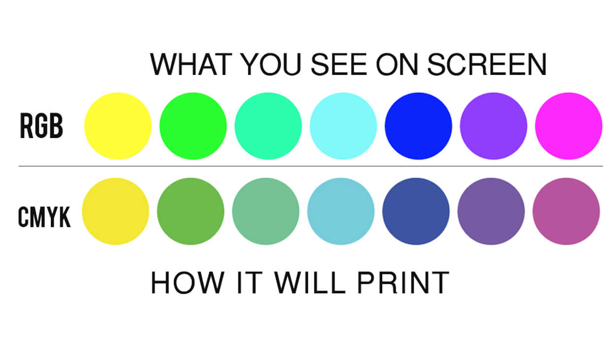
Reason #1 – Different Color Models
There are several color models, but the two most important spectrums for this discussion are the RGB and CYMK.
Computers and monitors typically use the RGB (red-green-blue) model. This is an additive color model where the pixels start off as black and then add red, yellow, and green in necessary intensities (from 0 to 255 each) to create the desired color.
On the other hand, the CMYK spectrum consists of four different colors: cyan, magenta, yellow, key (black). A printer toner holds limited amounts of these colors as powders and drips or deposits them precisely onto the paper. Each printed color is a combination of percentages of base CMYK colors (magenta is 100% M and 0% C, Y, and K). The more limited mixing options mean that the on-paper design can never be quite as bright or colorful as its on-screen counterpart.
Reason #2 – Added Display Brightness
The brighter your monitor, the easier it is to design your documents. However, the extra brightness can distort your creations and make them look different on paper. Therefore, print preview mode doesn’t always accurately portray the end result.
Reason #3 – Various Devices
Not all devices present your images using the same colors. For instance, if you send a PDF from your computer to a smartphone and print it from the mobile device, it probably won’t look the same as a copy printed directly from your PC. Additionally, compression often skimps on color details.
How to Fix Different Print and Screen Colors
The first problem is virtually impossible to address because that’s just how modern printers are designed. However, this doesn’t mean you’re powerless. There are a few ways to improve the quality of printed colors.
Adjust Your Design
Most modern design software allows you to use the CMYK color mode while designing. Keep in mind that monitors don’t display true CMYK colors since they use different blending strategies.
Lower Display Brightness
As previously discussed, high brightness gives you a skewed image of the actual colors. Keep the luminosity at about 50% to get a better idea of what the designs will appear on paper.
Consult Your Printer Manufacturer
Describe your color problem to your printer manufacturer. They may be able to suggest device-specific solutions to boost color quality, such as replacing the cartridge.
Just make sure to test each cartridge by printing two or three copies to prevent paper waste if the method doesn’t work.
Utilize the Pantone Library
The Pantone Matching System is a prominent solution that can increase color brightness on paper and make them more similar to their on-screen counterparts. It gives you access to a wide range of color swatches you can use as fixed color references, which reduces the discrepancies between display and printed shades.
Need Help With Color Differences? An Aftermarket Cartridge May Help
Sometimes, all it takes to reduce the difference between on-screen and printed colors is to replace the cartridge. Still, you shouldn’t install just about any cartridge. You need a first-class model compatible with most modern printers.
That’s where Copylite comes in. We offer cartridges that work with all major printer brands, including Kyocera and Konica Minolta. Try our products, and they may just give you the color boost that you’re looking for.